Showing posts with label female artist. Show all posts

Wednesday, March 23, 2016

Helen Frankenthaler, artist

Aleathia says:

I have been lucky enough in my travels to find an art museum to wander around and continue to be fascinated by the colors and movements swirling around in an artist's head.  I appreciate the depth and time it takes to create some of the master works in all of their glory and reality, but abstract art has always gripped me the most.  It is often the least understood and the hardest to explain. Most people like what is familiar and gravitate towards pieces that have a recognizable imagery. The wonderful thing about abstract art is each person gets to create their own interpreted story.  They can see what they want to see before understanding what the artist intended.


Helen Frankenthaler was born in New York City in 1928.  She was a notable American Abstract painter and helped to develop color field painting.  She exhibited work around the world starting in the 1950's until her death in 2011.  She continued to produce viable work her entire career.

Her main influences were Hans Hoffman, Jackson Pollock, and Clement Greenberg.  Frankenthaler's work is often identified "with the use of fluid shapes, abstract masses and lyrical gestures".  She has said "A really good picture looks as if it's happened at once."

The follow works of Helen Frankethaler are from the time span of 1952-1988. Her growth and color composition are most notable.

"It is an order familiar and new at the same time."--Helen Frankenthaler

1952 Mountains and Sea


This noted a big breakthrough in the style of painting with oils that looked like pastels and was then known as "stain painting".  Her work through the 1950's were similar in form containing evenly weighted compositions and stain painting.


1959 Mother Goose Melody


In this work the color palette is much darker and she invites the idea of a heavily, densely weighted side and an airy constructed side in the painting together.


1960-1962 Seascape with Dunes


This is a very centralized piece with a lot of raw canvas showing the stains of oil paints like ghost shadows.


1963-1968 Mauve District and Flood


These pieces were a large move towards acrylic paint which lent her to have a deeper sense of color within her chosen palette.  This move to acrylics saw less raw canvas and the paintings begin to feel more full and more abstract.


1970-1971  Sesame and Chairman of the Board


Frankenthaler continues the use of acrylics, but starts looking at her work with new formal consideration.

"Frankenthaler 'points to the four different compositional placements of the painting:its overall flatness, the play of the left side versus the right side, the interior of the white crossing passage--what she refers to as a cable or crevice'--and drawn lines, about whose space making she observes, 'I was very conscious of threading line through the cable/crevice'"


1972-1975 Hint from Bassano and Nature Abhors a Vacuum


Her work in this time is filled with wide swathes of color with the combination of levels both symmetrical and asymmetrical in context along with horizontal line movement.


1976-1977 Natural Answer and M.


After a trip to the Southwest, Frankenthaler came home with a new color palette which were mostly terra cotta shades. In this time period, the paintings were actually painted instead of stained.  With this there is a definite sense of structure and horizontal brush movement.


1978-1981  for E.M.


Paintings are becoming more rigid with themes and lines have a more interlocking look.  White starts to be a significant accent through them.


1981-1985 Reflections on a Blue Pool


Frankenthaler moves into a new period where the paint appears stained again with the addition of raised paint which adds texture and depth to the work.

1986-1988 Morpheus


She begins to move into implied grid like structures lending the work to have a more vertical movement and feeling.


I hope you enjoy these few selections from Helen Frankenthaler's collection.  Feel free to look her up as there is a vast amount of her work on the internet.

Saturday, April 4, 2015

4/4/2015 Katherine Bowling and poem of the day

Aleathia says:

Believe it or not I get my education on contemporary artists from Pintrest.  There are always fantastic artists being posted there that really catch my eye.  I'm terrible about remembering where or when I see new art so it is convenient that I can save (or Pin) artists in a folder and revisit them.


The artist I would like to feature today is a woman named Katherine Bowling.  She was born in 1955 in Washington D.C. but gets her inspiration in my NY backyard of the Hudson Valley.  She has a rented home there where she spends time taking pictures which she then uses to transform into great pieces of art.  Her work is primarily landscapes, but the effect is very ethereal and dreamy.  It translates those moments when you have a seeming out of body experience in nature.  I know I have had these when I am overtaken by the beauty of nature so much that I do not feel as if I have a separate existence.  Our atoms mix.  Nature and body are but the same thing.  When I saw Katherine's work it reminded me of those feelings.

Bowling works in oils but has a process that uses spackle and sanding to create the texture that catches my eye.  Her work is also primarily on wood panels.  You can read through Katherine Bowling's career achievements at her website.

She has two primary collections called Ether and Divide.  Here are some selections from both of those collections:


"Curve"


"Moon"


"Petal"


"Pond"


"Shine"


"Storm"


"Vacation"


and the prompt today is "departure" which can be interpreted in any way you choose.  Leaving is leaving, right?  I happened to find this poem today and the original notes were from 3 years ago, but I reworked it today in my present state of being.


Smooth Scars

Sometimes the poem is dead inside.
It’s lifeless carcass staring at me
with great longing.

I circumnavigate its bulk
not willing to captain
the ship of words
needed to resume it.

Part of me feels like weeping
over its smooth black tombstone,
the other half smiles in the satisfaction
of being all consuming in living.

The poem flourished when I rotted
from the inside, living off the purification
of dreams.

This has healed
clean and pink and filled
with smooth scars
that don’t need
another stack of words
to validate my existence.

Aleathia Drehmer 2015

April 4, 2015

Friday, January 23, 2015

Art Bomb-1/23/2015 Clare Johnson. Henri Matisse

Aleathia says:

Originally I was going to try and profile artists from all the states in a sort of alphabetical order, but that really isn't my gig so I am going to try and hit all the states that I have lived in first and see how it goes.

One of the most influential times in my life, when I found out who I really was, happened in Seattle. It is the classic small town girl goes to big city story.  I had some of the best times of my life there, but in the end came back to the state of my youth to grow my roots.  Seattle was a beautiful garden of art and music and writing.  There was so much to do and see there.  It was hard to cover it all.  Having said that, today's artist is Clare Johnson from Seattle, Washington.


Clare Johnson is from Seattle, WA but obtained her education in many places including Brown University and in London at both the Slade School of Fine Arts and Central St. Martin's College of Art and Design.

Her ink drawings are painstakingly detailed, intricate, and intimate.  They are said to obsessively deal with the lines between solitude and loneliness; the lines between comfort and disconsolation.


This project started as nightly drawings on post-it notes before going to bed and blossomed into a fine collection of black and white snapshots of simple, but eye catching scenes.


Johnson's paintings are usually exhibited on stretched, unframed canvases to confirm to the viewer that something is always missing.


John Says:


I go and see a lot of art. Yet I don’t really know how to write or talk about it. I see these people in galleries or in museums standing in front of the paintings and dissecting them to the point of ridiculousness. At times it’s reached a point where I wonder if these people have come to the museum to look at a van Gogh or an Andre Derain because they like the art, or because they want to hear themselves pontificate on yet another idea that they’ve gotten wrong. I guess these blowhards beat the people who walk up to a painting, snap a photo, and then walk away. To these morons seeing great art is akin to standing in front of a big, famous building, or photographing their shitty lunch. The works of the masters have become yet another notch on their social networking belt.

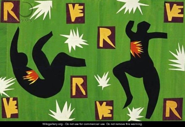
Anyway since October the MoMA has been putting on a huge retrospective of Henri Matisse’s Cut-Outs. If I may lift or paraphrase from the MoMA’s web site, the Cut-Outs were a series of works that Matisse began doing in the late 1940s once he got too old and senile to paint regular paintings. Essentially the Cut-Outs (should I be capitalizing this?) are painted pieces of paper cut-out in order to form shapes or designs, or in some instances like this one (a personal favorite) made as prep work for a stained glass window:


Matisse used his cut-out scheme for his print book Jazz (1947):


His cut-out work was also featured on the cover of several issues of the French art magazine Verve


Good ol’ Henri even decorated his dining room in his apartment with cut-outs, this one being his famous and not often seen The Swimming Pool:


And who could forget Henri's famous Blue Nudes:


I’m not going to begrudge Matisse his art. No one is above criticism but maybe a guy who gave Picasso a run for his money back in the day gets a pass. Or maybe not. That is to say I was pretty unimpressed by the Matisse Cut-out exhibit. There were over 100 works in the thing (again, I’m pillaging the MoMA web site), and I spent a good hour in there only to walk out and look at my wife and shrug.  I had a much better time looking at the Toulouse-Lautrec and Jean Dubuffet exhibits. It’s hard to admire something that I could do on my own, or even sit down and watch my soon-to-be five year old niece do….although she’s a pretty keen artists. Even psychiatrists get her. I’ve always been more impressed by something like this:


But what do I know? The exhibit is beyond popular right now. You need an appointed time to go in and view it, and then really it’s simply being overwhelmed by the amount of cut-outs hanging on the walls, the crowds trying to talk art, kids bitching about being hungry, teens sitting on the floor texting their friends, or bitching to the guards about how they aren’t allowed to take selfies with the art.

Matisse: The Cut-Outs runs at the MoMA until February 10, 2015